Project Overview

Financial Consulting Firm Brand

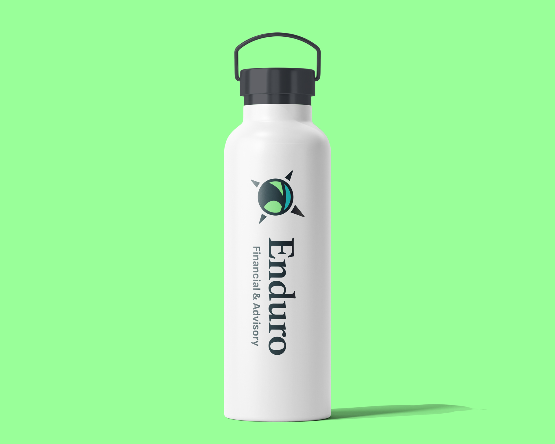
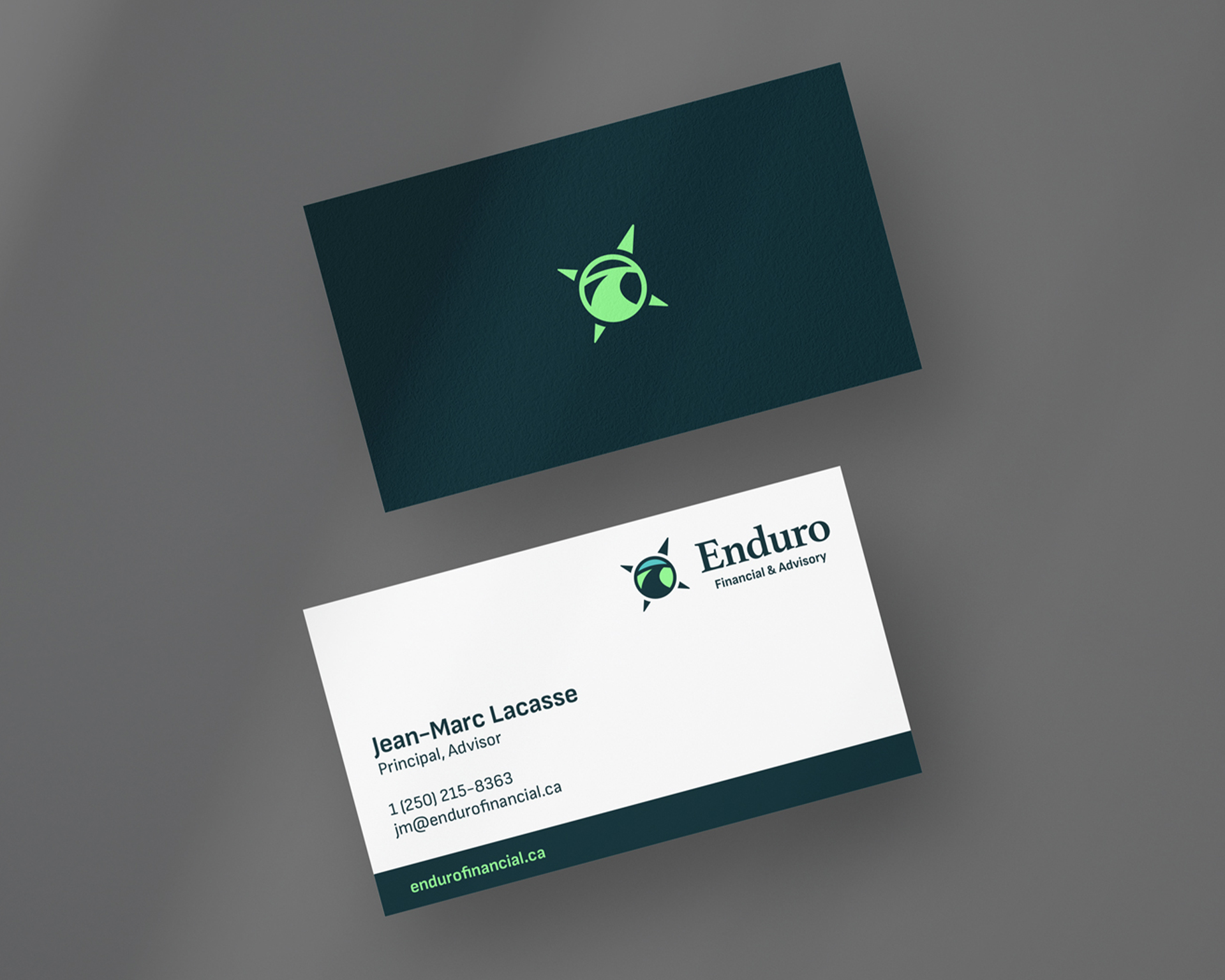
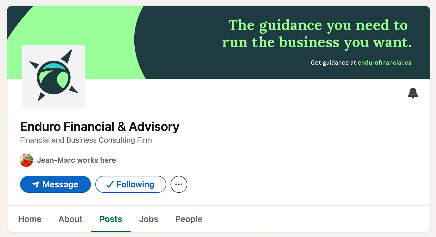
Enduro Financial & Advisory approached me in need of a name, website, and brand for their consulting business that would build brand equity and be a valuable asset for the future.

After going through my brand naming process, we narrowed it down to Enduro. This made-up word captured the qualities my client wanted to establish and depicted them in a strong, trustworthy manner. Trust is essential for a financial advisory firm. It was also unique and available as a URL which is another important consideration for any modern business.

Creative Direction, Naming, Brand + Brand Guidelines

BRAND DEVELOPMENT

I designed Enduro Financial & Advisory’s logo to tick off several boxes:

• Depict partnership on a journey
• Create trust for clients
• Build long-term brand value
• Communicate expert guidance

The goal was to create something with a modern appeal that would work in multiple applications:

• Website and email campaigns
• Branded print material
• Social media

Brand nouns that guided the design direction included terms such as compass, path, road, guide, gear, map, and structure. We tied all these together to create the three different options visible to the left, from which my client selected their favourite choice.

FINAL WORDMARK

& LOGO

The final logo is similar to one that we explored initially. Utilizing the college practice of acronyms for school names an emblem featuring the APC letters came together centred by a gold North star. The three colours chosen for each letter help balance a warm palette of yellows and reds with the cooler colours of ocean and sky that surround Vancouver.

The APC emblem, combined with the stacked word-mark, resonated as both modern and professional, lending an immediate credibility to this new school and helped bring in the first cohort of students.

Social Media