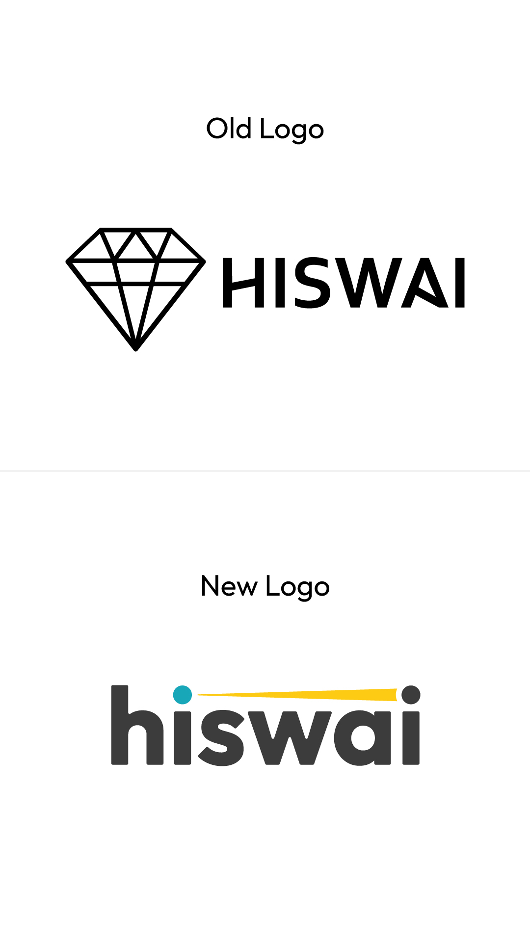
For this rebrand, I took it back to the drawing board.
The old logo was unbalanced and made use of a standard but slightly customized typeface and the diamond symbol was too generic to accurately represent what Hiswai does; connect ideas and searches autonomously and provide its users with in-depth and detailed specific results.
We switched this logo to a modern and friendly typeface and simplified the idea of connection down to the beam of light between the two i’s of the logo.