REBRAND

Mavrik Barbell has a long history of manufacturing high-quality and high-durability weight-lifting plates. My client is proud to re-launch the Mavrik Barbell brand with a commitment to the same standards that made them an industry staple since the 1960’s.

The project was to modernize a brand that had name-recognition but needed an update to how it could be marketed, there was little brand-presence for an impressive product. The desire was for something bold and modern, with a visual cue to the product itself.

BRAND DEVELOPMENT

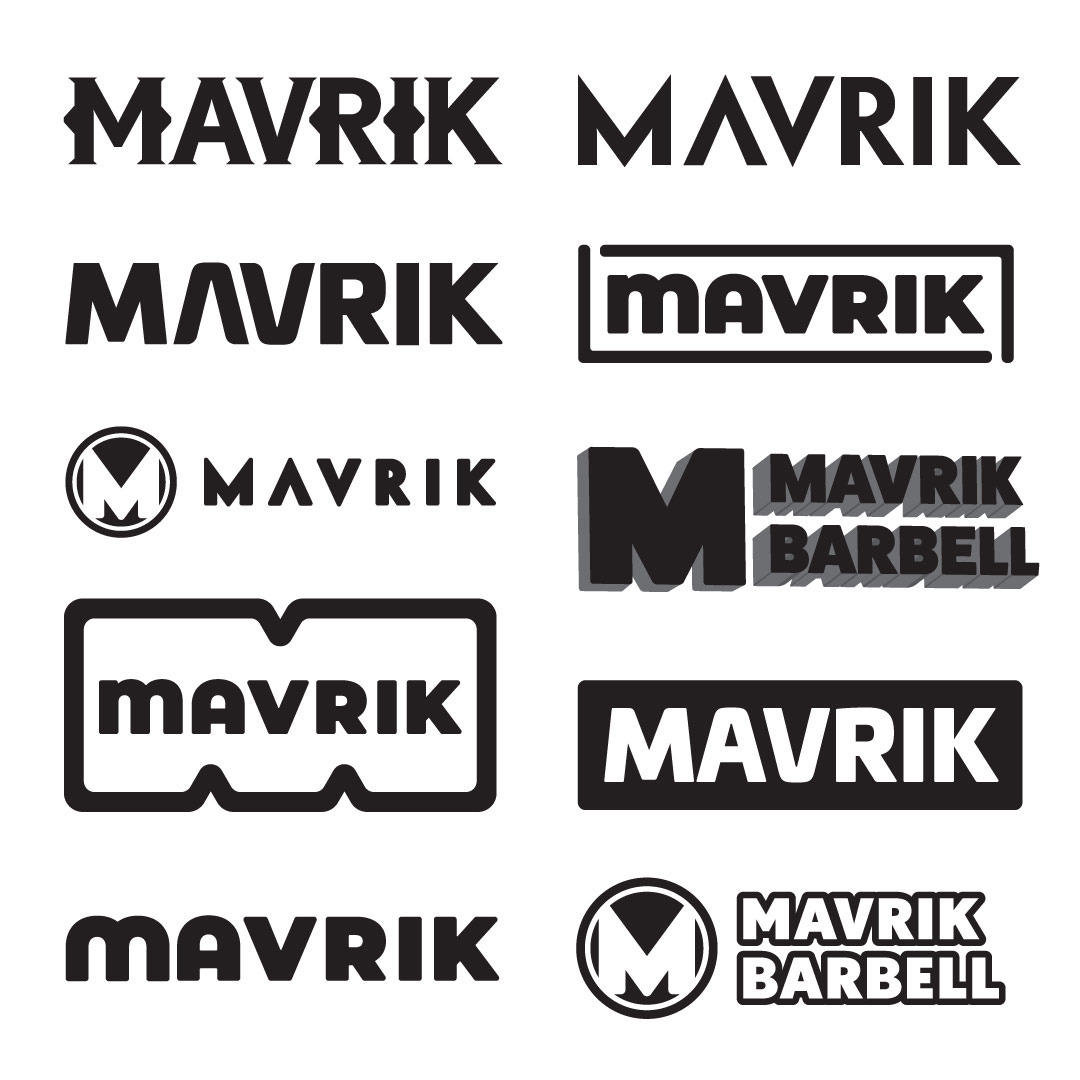
The preferred direction given by my client for Mavrik’s new logo was bold and modern. The exploration then was primarily carried out in that direction as evidenced by some of the examples provided.

LOGO + MARK

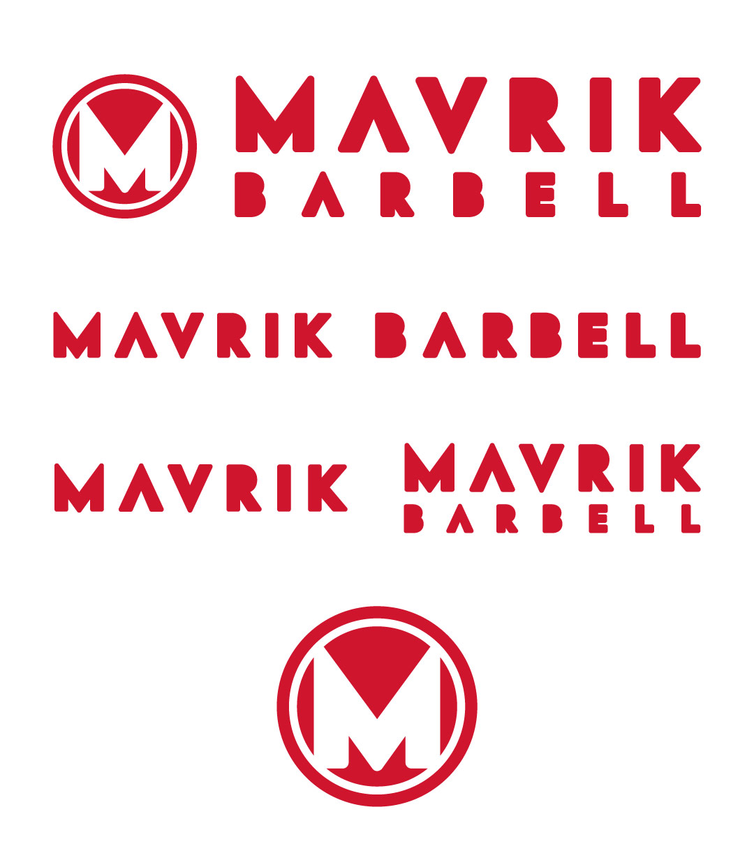
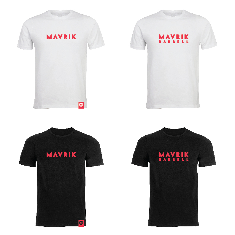
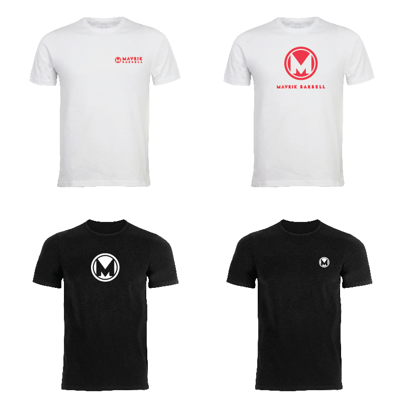
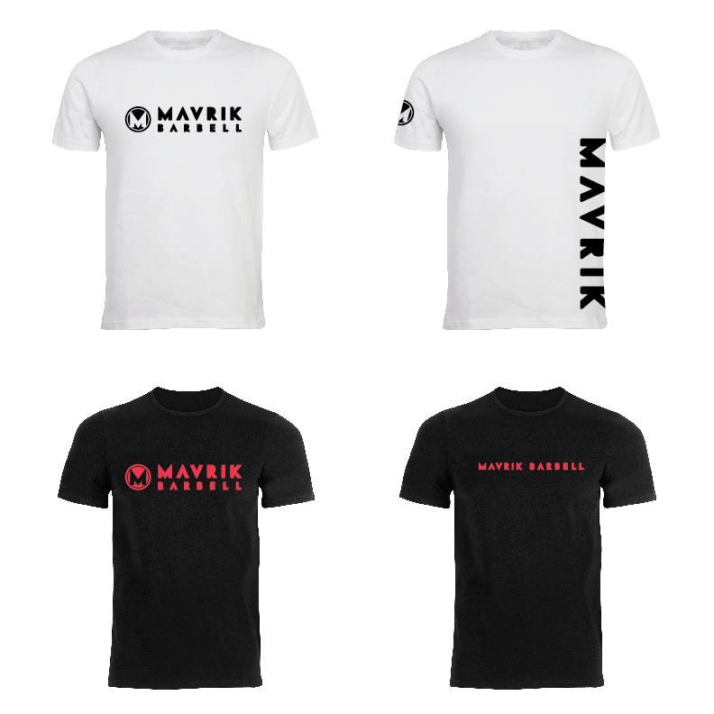
I played around with several font options and customizations before landing on a customized VF Sans with added stroke and rounded stroke corners to take a little of the edge off. One variation I provided as seen above was the crested M, meant to look like a weight lifting plate, but also carrying the stylized M within it. That crested M is ultimately what led to my client’s final decision on the logo choice. The logo has several variations and applications as can be utilized for web, social, print and apparel.

PLATE DESIGN

APPAREL

DETAIL HIGHLIGHT

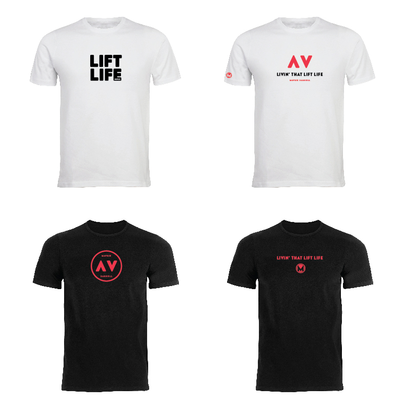
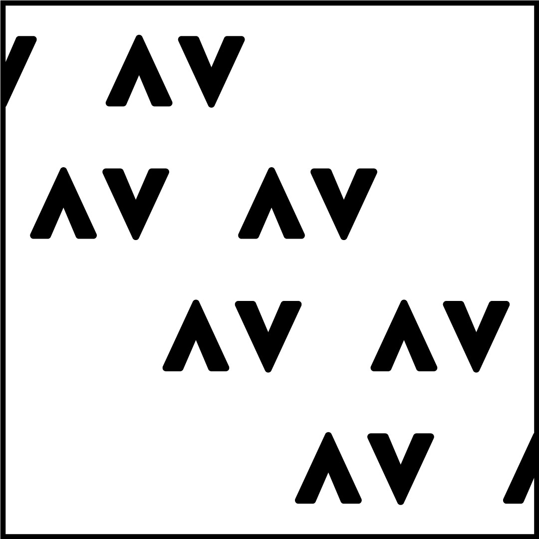
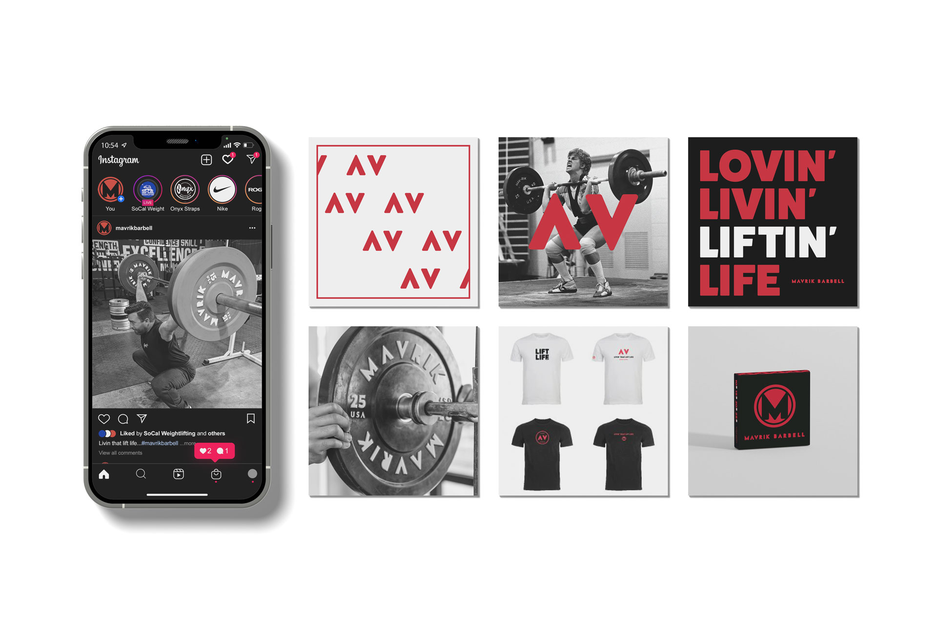
One of my favourite aspects of the logo is the subtle up and down arrows that are built into the AV of the MAVRIK logo. This was to suggest the motion of weight lifting, straight up and then back down. I enjoyed using this as a pattern on the box and in a few apparel applications as an on-brand visual extension that could stand on it’s own once brand recognition becomes more commonplace.

PACKAGING

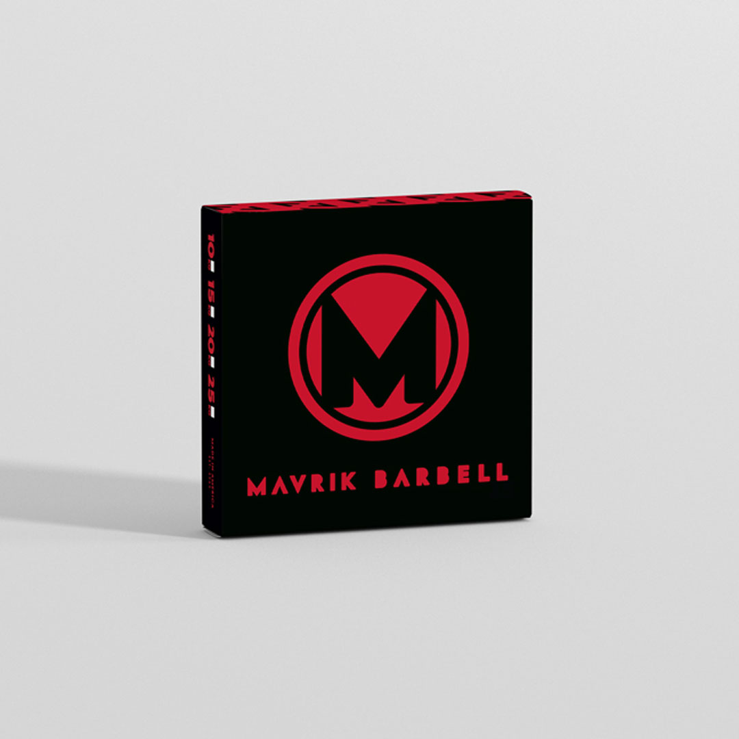
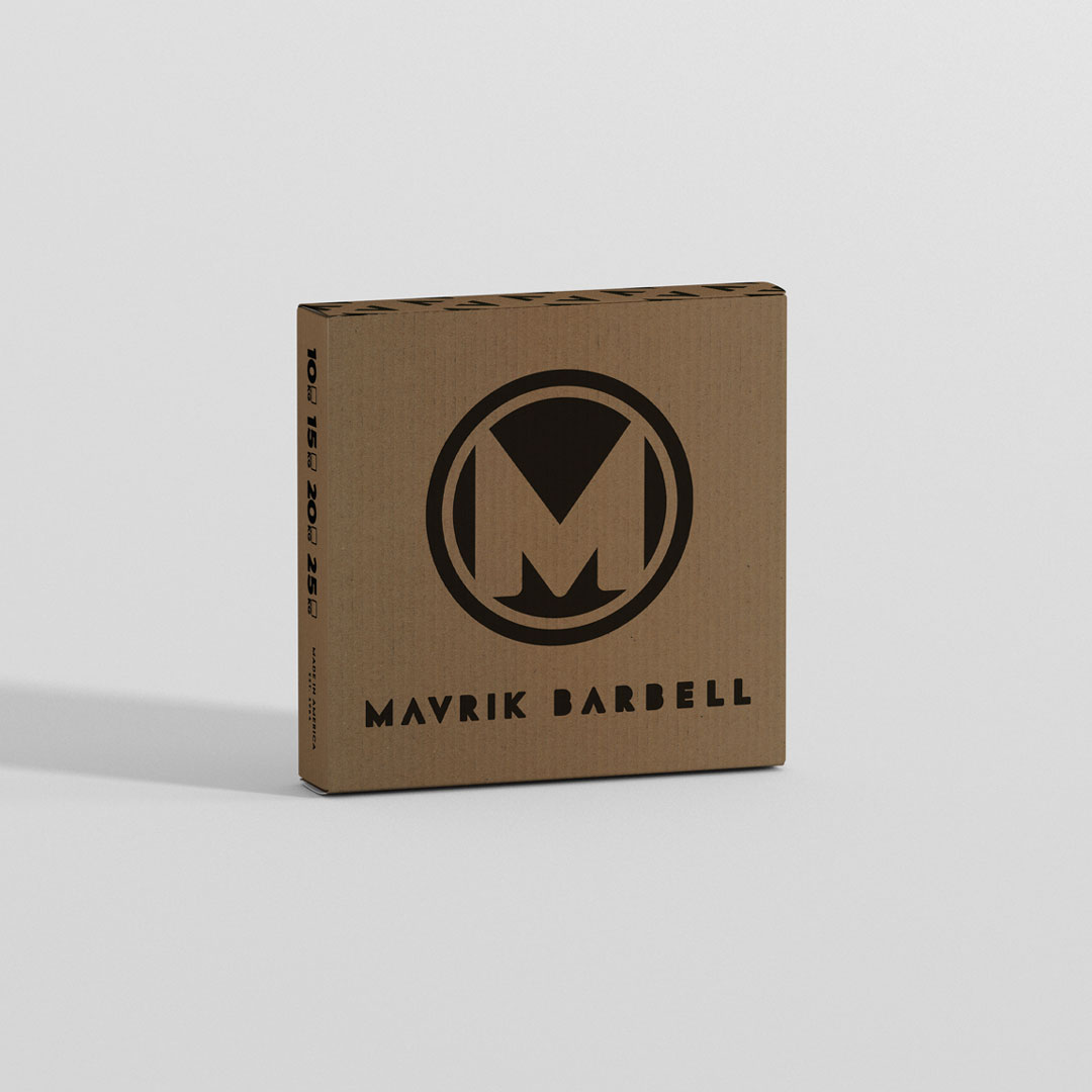
Initially we did a full colour design for the shipping boxes but the realities of printing costs were too prohibitive so a more stripped down one colour print became the preferred option.

INITIAL CONCEPT

REAL WORLD SOLUTION

SOCIAL POSTS

BANNER DISPLAY