Project Overview

Painting Company Rebrand + Website

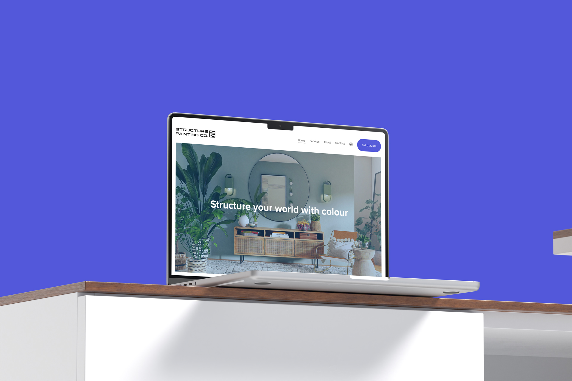
Structure Painting required a new logo and website to launch their new business. They are a commercial and residential painting company primarily working with high-end clientelle and businesses.

During discovery they presented a wide variety of inspiration for brands and logos that they liked as well as competitors they wanted to stand out from. They wanted something modern but also with a bit of a graphic nature indicating the hands-on business of painting and coating that they specialize in.

Rebrand + Website

BRAND DEVELOPMENT

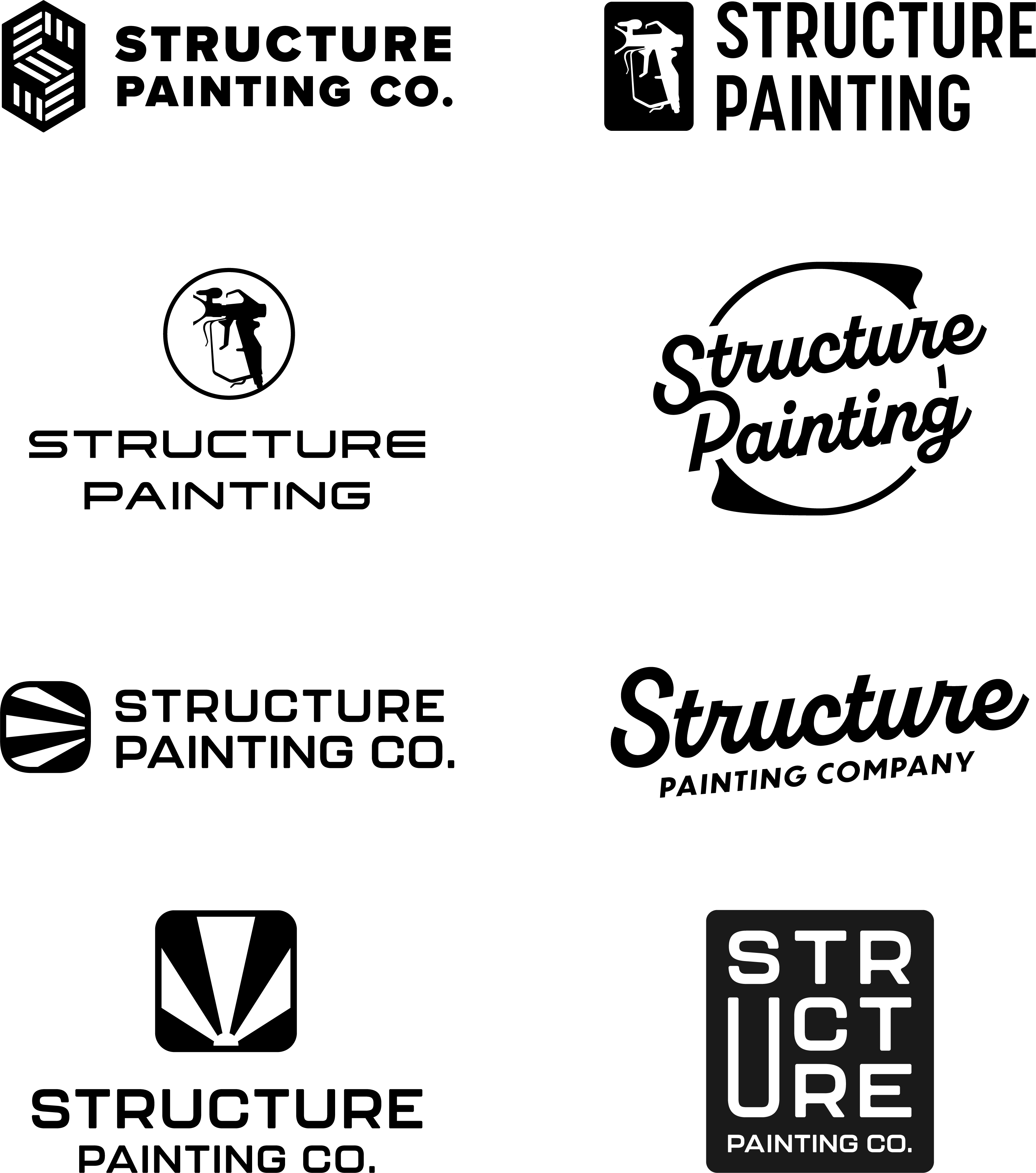
A wide variety of exploration was done to try to capture the essence of what inspired the small business owners.

• Modern
• Graphic element
• Professional

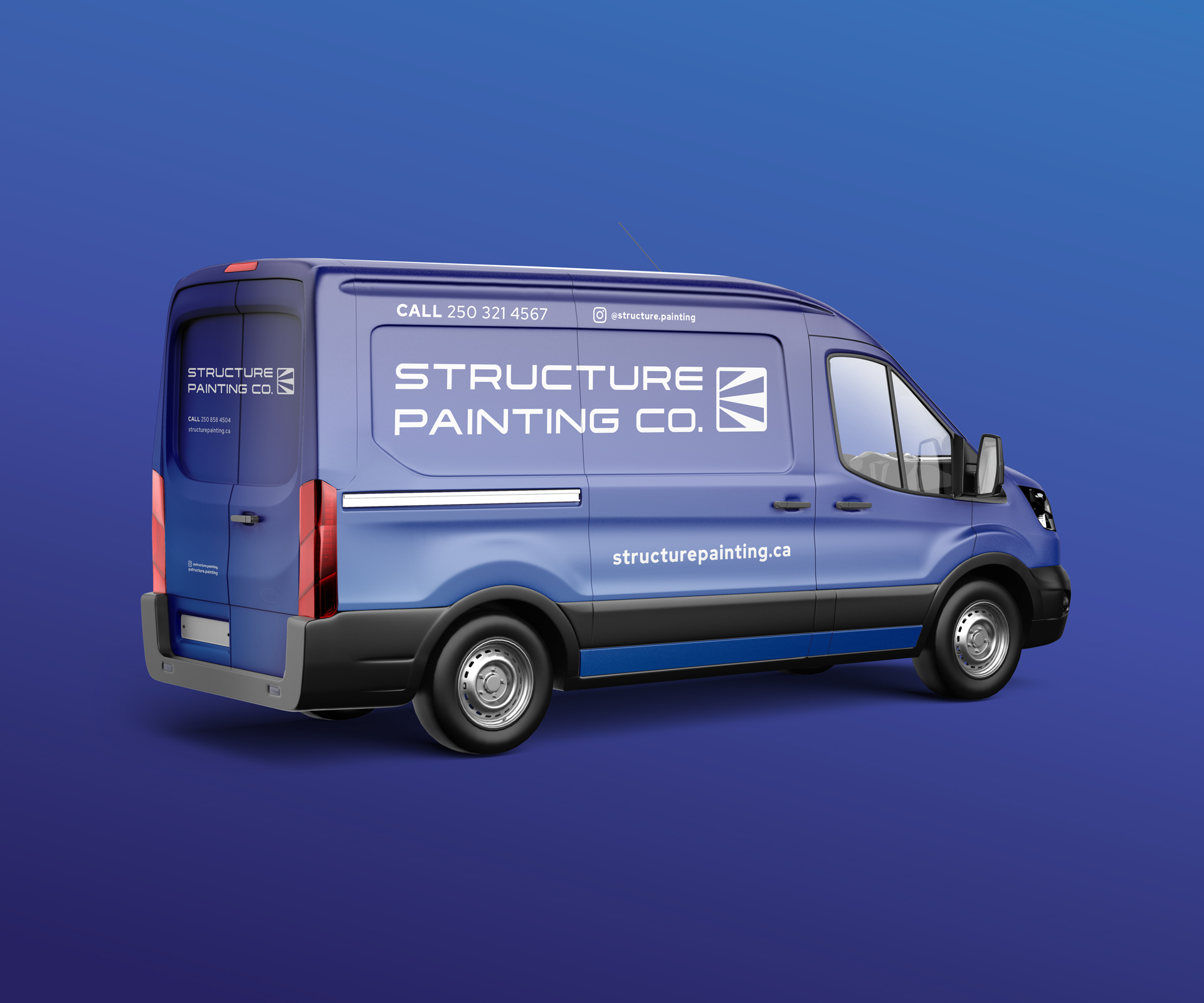
The goal was to create something contemporary that would work in multiple applications:

• Website
• Digital marketing
• Social media
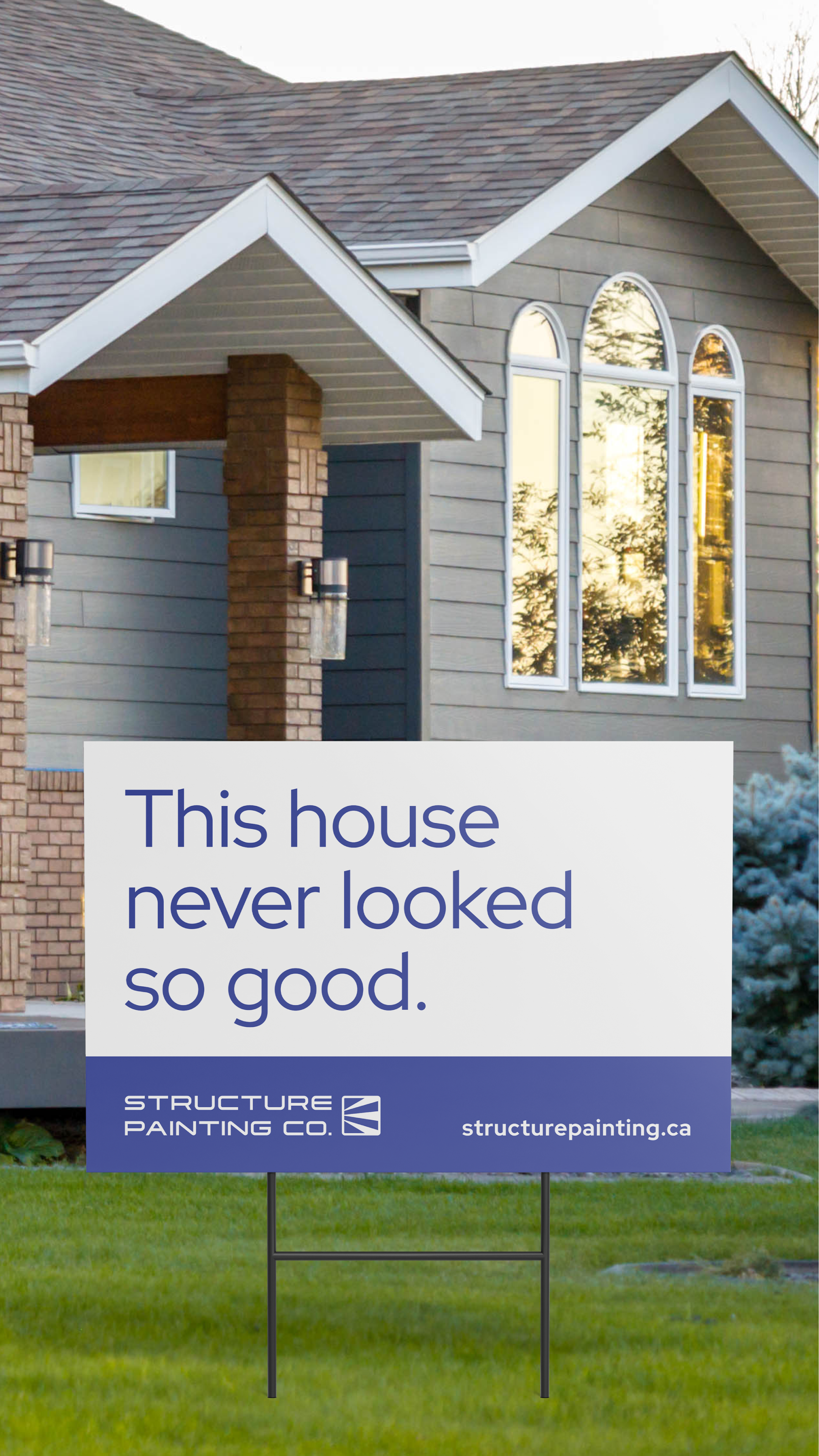
• Branded print material
• Merchandise

Visual concepts we explored include tools of the trade, a variety of typefaces, different graphic treatments, allusions to painting and creating a professional look.

FINAL WORDMARK

& LOGO

The final logo came together after a few iterations. The contemporary typeface Tachyon was the preferred font option for the wordmark portion of the logo.

Then, after some tweaks to the spray symbol that accompanies it, things like matching the corner radii of the letters to the corners of the spray symbol and matching the stroke of the symbol’s outline to the weight of the typeface, we landed on our final logo.

WEBSITE